Because the logo is our primary brand identifier, always apply it with care and respect. Use only the approved electronic artwork. Never alter, add to or redraw the logo in any way. This is the preferred logo variation for all brand communications.
Primary Logo
Clearspace and minimum size
To ensure the prominence and legibility of the logo, always surround it with a field of clearspace. Clearspace isolates the logo from competing graphic elements, such as text, photography and background patterns. The absolute minimum amount of clearspace is equal to the height and width of one of the color squares in the symbol (in the size at which the logo is reproduced).


The Cleveland Clinic logo can be used in a variety of sizes, but when it is too small, it is harder to read and isn’t as effective. In printed material, do not use the logo with a symbol smaller than .25” wide.

Primary colors
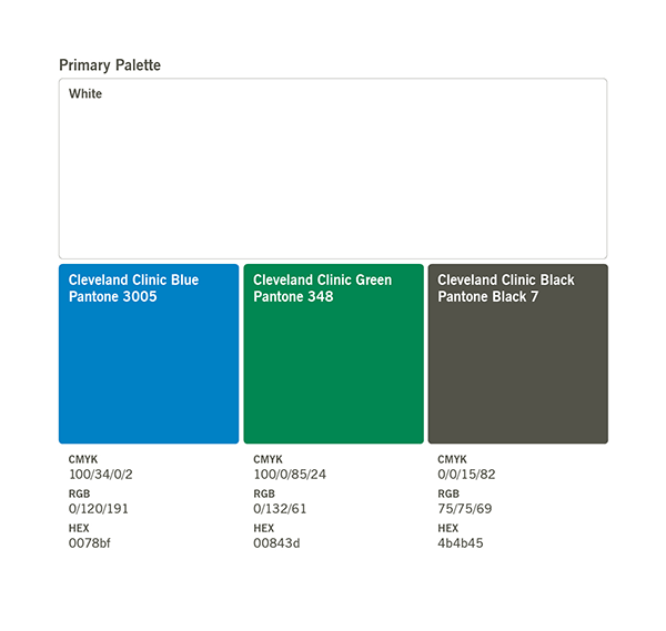
Whenever possible, reproduce the Cleveland Clinic logo in full color — using Cleveland Clinic Blue, Green and Black. See the Pantone numbers listed below.

For 4-color process printing, use CMYK values. For on-screen applications (e.g., video, broadcast), use RGB Video values.
Pantone and CMYK values can be used for printing on both coated and uncoated paper. Although color variations will occur, try to match the colors as closely as possible.
Logo color variations
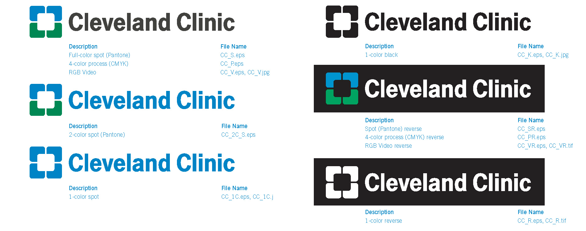
When reproduction methods cannot accommodate a full-color logo, use an appropriate color variation shown below. Positive and reverse versions are included.
Carefully evaluate the background before making a selection. In general, backgrounds that are approximately 45% black or darker will require a reverse logo.

The CMYK variation is for both digital and offset printing. RGB is for on-screen viewing, such as in PowerPoint presentations and video. RGB/web-safe logos are for Internet and Intranet use and are created from a web-safe color palette.
Background control
The full-color Cleveland Clinic logo always looks best against a white background. A white background gives colors a clean, crisp contrast.
If the full-color logo appears on color or photographic backgrounds, there must always be sufficient contrast between the background and the logo colors. If there isn’t sufficient contrast, use the reverse logo.

Background misuses:
- Do not use the full-color logo on a gradient background.
- Do not use the full-color logo on a background where the symbol may be hard to see.

Logo misuses
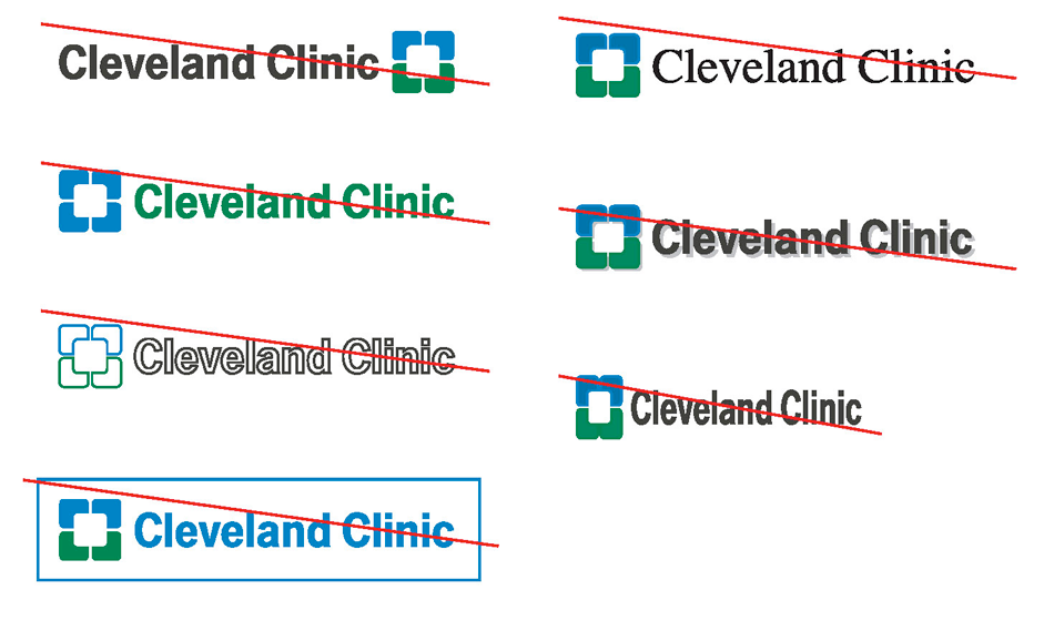
Using the Cleveland Clinic logo incorrectly can compromise its integrity and effectiveness. Shown below are some possible misuses.

To ensure accurate and consistent reproduction of the logo, use only the approved digital artwork. Never alter, add to or re-create the logo.
- Do not change the arrangement of the preferred logo lockup.
- Do not change the color of the symbol or name.
- Do not outline the symbol or name.
- Do not violate the clearspace or place the logo within a shape.
- Do not change the font.
- Do not apply a drop shadow.
- Do not horizontally or vertically distort the logo.
Alternate logo configuration
Before using this logo variation, you must get approval from the Cleveland Clinic Division of Marketing.
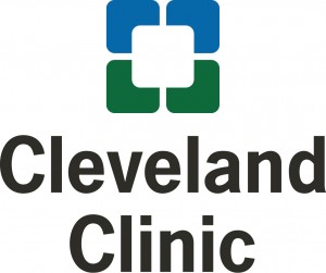
In the alternate logo configuration, the Cleveland Clinic name is centered under the symbol.

Use this configuration only when a layout has limited horizontal space or when the symbol needs to be more visible. Uses may include sports arenas or stadiums and merchandise or promotional items.
Use only the approved digital artwork. Never alter, add to or re-create the alternate logo in any way.
Using the symbol alone
Before using this logo variation, you must get approval from the Cleveland Clinic Division of Marketing.

The Cleveland Clinic symbol can appear by itself only in special applications (e.g., promotional items, jewelry, other specialty merchandise). It is not to be used to replace other symbols. Use only the approved electronic artwork.
The symbol must never be used by itself in brand communications. Only the Cleveland Clinic logo — including symbol and name — can be used to identify the Cleveland Clinic brand.
Hint: For proper orientation remember, sky above and grass below.
Symbol misuses:
- Do not place images in the middle of the symbol.
- Do not fill the symbol with images.
- Do not fill the symbol with words.


