Icon Pattern
Diagonal
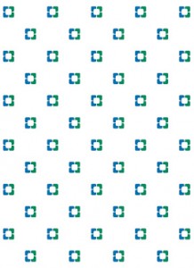
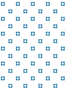
The Cleveland Clinic icon can be applied in a diagonal pattern as either a primary or secondary design element.
As with our logo, the 2-color variation is preferred. The 2-color pattern can appear only in Cleveland Clinic Blue and Green.
However, 1-color, 1-color tint and black variations also are available to accommodate various design needs and printing limitations. The 1-color pattern can appear only in Cleveland Clinic Blue, Green or Black. The 1-color tint pattern should be a 10 to 20% tint of Cleveland Clinic Blue, Green or Black.
| 2-Color | 1-Color | 1-Color Tint |
|---|---|---|
 |
 |
 |
Diagonal reverse
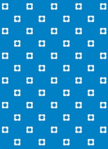
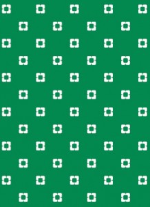
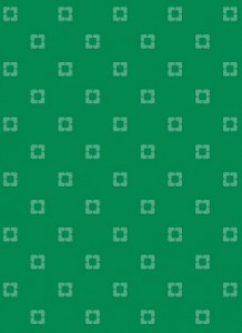
When applying the diagonal icon pattern over Cleveland Clinic Blue or Green color fields, reverse the pattern to white. The diagonal reverse pattern can be used as either a primary or secondary design element.
For some specialized applications, the pattern may be reproduced in a 70 to 80% tint of the background color.
| 1-Color Blue Diagonal Reverse | 1-Color Blue Diagonal Reverse Tint | 1-Color Green Diagonal Reverse | 1-Color Green Diagonal Reverse Tint |
|---|---|---|---|
 |
 |
 |
 |
Aligned
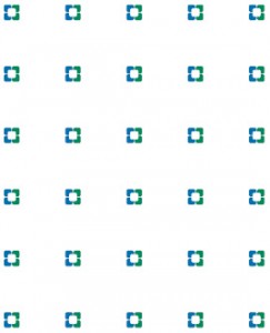
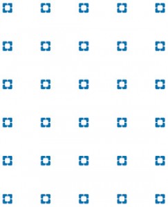
The Cleveland Clinic icon can be applied in an aligned pattern as either a primary or secondary design element.
As with the logo, the 2-color variation is preferred. The 2-color pattern can appear only in Cleveland Clinic Blue and Green.
However, 1-color, 1-color tint and black variations also are available to accommodate various design needs and printing limitations. The 1-color pattern can appear only in Cleveland Clinic Blue, Green or Black. The 1-color tint pattern should be a 10 to 20% tint of Cleveland Clinic Blue, Green or Black.
| 2-Color | 1-Color | 1-Color Tint |
|---|---|---|
 |
 |
 |
Aligned reverse
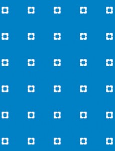
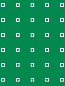
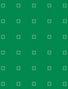
When applying the aligned icon pattern over Cleveland Clinic Blue or Green color fields, reverse the pattern to white. The reverse pattern can be used as either a primary or secondary design element.
For some special applications, the pattern may be reproduced in a 70 to 80% tint of the background color.
| 1-Color Blue Aligned Reverse | 1-Color Blue Aligned Reverse Tint | 1-Color Green Aligned Reverse | 1-Color Green Aligned Reverse Tint |
|---|---|---|---|
 |
 |
 |
 |
Cleveland Clinic Children’s: Hand Icon
The hand icon in the Cleveland Clinic Children’s logo can be used as a supergraphic or in a pattern. Never alter, add to or recreate the hand artwork.
Diagonal
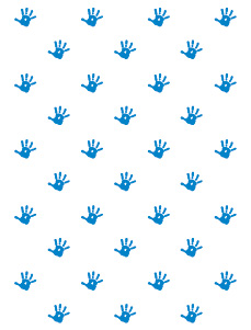
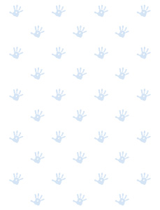
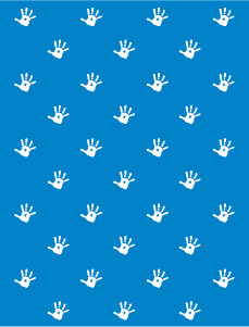
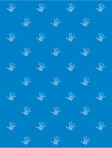
The Cleveland Clinic Children’s hand can be applied in a diagonal pattern as either a primary or secondary design element.
The preferred color of the hand pattern is Cleveland Clinic Blue. However, 1-color with 10 to 20% tint, reverse, and reverse with 50 to 80% tint variations also are available to accommodate various design needs and printing limitations. The hand pattern cannot appear as a tint of any color except Cleveland Clinic Blue.
| 1-Color Blue Diagonal | 1-Color Blue with Tint | 1-Color Blue Reverse | 1-Color Blue Reverse with Tint |
|---|---|---|---|
 |
 |
 |
 |
Aligned
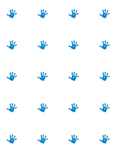
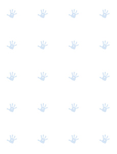
The Cleveland Clinic Children’s hand can be applied in an aligned pattern as either a primary or secondary design element.
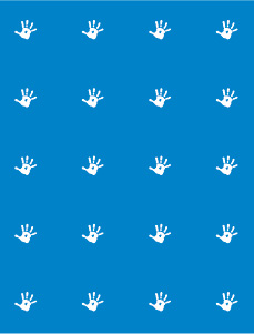
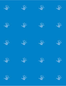
The preferred color of the hand pattern is Cleveland Clinic Blue. However, 1-color with 10 to 20% tint, reverse, and reverse with 50 to 80% tint variations also are available to accommodate various design needs and printing limitations. The hand pattern cannot appear as a tint of any color except Cleveland Clinic Blue.
| 1-Color Blue Aligned | 1-Color Blue with Tint | 1-Color Blue Reverse | 1-Color Blue Reverse with Tint |
|---|---|---|---|
 |
 |
 |
 |
Supergraphic
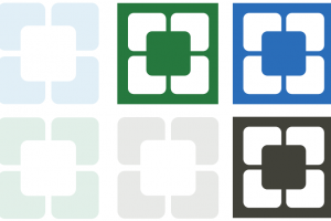
The Cleveland Clinic icon can be enlarged and used as a supergraphic. The supergraphic can appear only in a 10% tint of Cleveland Clinic Blue, Green or Black. Ensure the supergraphic is never cropped by the edge of a layout or by a design element.
The supergraphic can appear in its entirety or can be dynamically cropped so that it bleeds off the page.
Cleveland Clinic Children’s: hand supergraphic
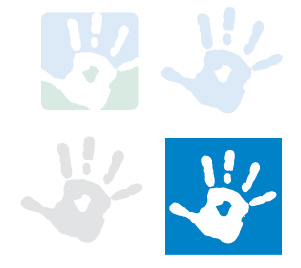
The Cleveland Clinic Children’s hand can be enlarged and used as a supergraphic. The supergraphic hand can appear only in a 10% tint of Cleveland Clinic Blue and Green, Blue or Black (Black and White jobs only) or reversed out of Cleveland Clinic Blue. Ensure the supergraphic is never cropped by the edge of a layout or by a design element.
The supergraphic can appear in its entirety or can be dynamically cropped so that it bleeds off the page.
Illustrations
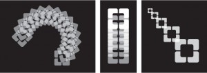
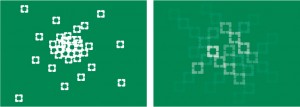
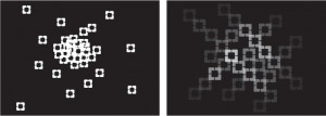
Inspired by the Cleveland Clinic logo, the graphic illustrations shown below were developed for additional design interest and flexibility. They symbolize concepts such as natural structure and active reasoning.
They may be reproduced only in reverse or in tints of Cleveland Clinic Blue, Green and Black.
Do not recreate or alter these illustrations in any way.
| 1-Color Green Reverse | 1-Color Blue Reverse | 1-Color Black Reverse |
|---|---|---|
| Dynamic | Dynamic | Dynamic |
 |
 |
 |
| Multiplicity | Multiplicity | Multiplicity |
 |
 |
 |
| Vibrating | Vibrating | Vibrating |
 |
 |
 |
Medical illustrations
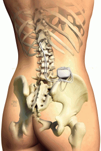
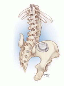
Please note: Clip art and illustrations, other than professional medical illustrations, are not to be used. Contact Cleveland Clinic Medical Illustration for medical illustration needs.
Only professional medical illustrations such as those below, are representative of the brand.
 |
 |
 |
 |
 |
Charts
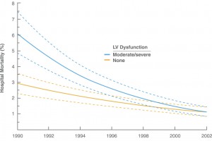
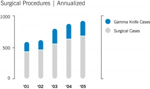
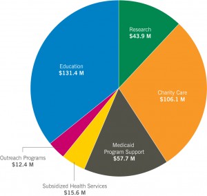
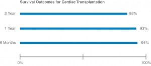
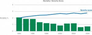
Charts and graphs should also reflect the brand attributes. They should be kept simple, clean and clearly legible.
 |
 |
 |
 |
 |
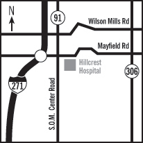
Maps
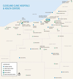
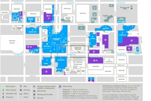
Maps, if not supplied, should be constructed using News Gothic, Cleveland Clinic’s primary typeface. They should be kept clear and simple, and be clearly labeled, reflecting the brand personality.
 |
 |
 |

