These are the defining colors of the Cleveland Clinic brand. Our primary colors must dominate any Cleveland Clinic communication to employees or patients/consumers.
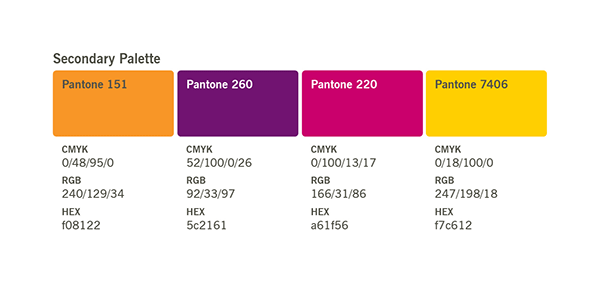
Secondary colors can be used along with the primary palette as accent or “spice” colors. They should never visually dominate a communication but should be used for variety and emphasis.
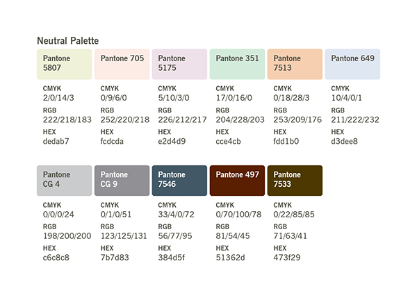
Supporting colors are organized by “mood palettes”: brights and neutrals. Use mood palettes in a supporting role, to communicate audience-specific attributes.
The Pantone and CMYK values can be used when printing on both coated and uncoated paper. Although color variations will occur, try to match the colors as closely as possible.
Primary Colors
As shown below, our primary color palette includes all colors used in the Cleveland Clinic logo. These colors also can be used for backgrounds, text and other design elements.

Secondary Colors
Secondary colors should never dominate a communication. Avoid overusing these colors to preserve their impact and meaning.
The colors of the secondary palette were selected to complement the primary colors and to add design flexibility. Some common uses include messaging and data in charts and graphs.

Supporting Colors
The supporting color palettes include bright and neutral colors. Softer and more subtle, these colors symbolize many brand personality attributes and can be effective in specific communications.
For example, colors from the brights palette work perfectly as color fields in Cleveland Clinic Children’s brochures. Rich, deep charcoal gray from the neutrals palette can be used to suggest status and sophistication.
Brights

Neutrals


